Five steps in OpenRefine that can save hours of time
It is a frequent lament that governments and organisations tend to release information with the intention of it just being read and consumed without much thought of making the underlying data accessible for analysis. In order to actually use this data then, one first needs to ensure that it is in a useable format. In these cases, we often turn to OpenRefine to pull things into the format we need.
This post is aimed at journalists and potential users of OpenRefine who have limited, or no experience at all, using it.
We are currently working on a data-driven feature about poverty and women-headed households, using a dataset from the South African government’s War on Poverty programme between the years 2008 to 2014. What we wanted to do was to compare the number of cases identified in the 2011 census and the number identified in the War on Poverty project, however we first needed to wrestle the data into shape.
This is a step-by-step description of the process we followed. Hopefully sharing this with you will make your life easier in the future.
This is how we worked our magic
Using the tool Wazimap, we came across the data we wanted: households divided by head-gender, district and by income. As with life, things are never that straightforward and when we downloaded it, the format was not exactly what we needed. Time to put some trusty OpenRefine skills to work.
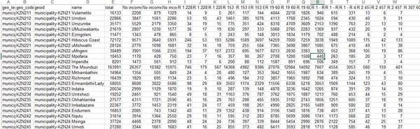
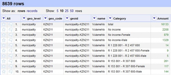
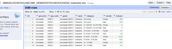
This is what we received. Note that every branch of income has three different columns; overall total, total male and total female samples.
In less than 10 minutes, we had our final format.
The five steps
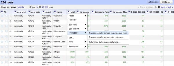
- Upload the Excel document to Open Refine and transpose the cells so the listed column categories become rows.
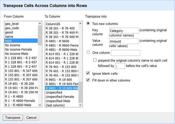
- In the next window, name the two new two columns, choose the option “fill down” and then click transpose.
- (If you have columns with blank spaces in the dataset you will have to do this process manually. To do this click on the arrow to view the dropdown on the column you want to transpose. Select “edit cells” and “fill down”. Tip: If you have blank spaces it is better to edit it with a value - like “null” - before you do upload it to OpenRefine)
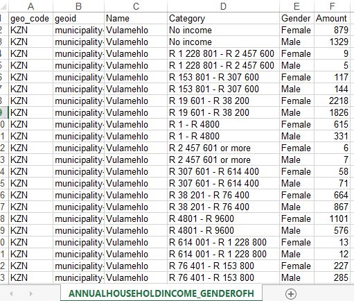
- Your data will now look like this:
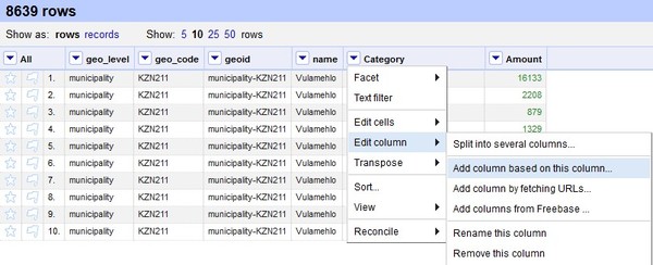
- Next, create a column named “gender” using category as the base.
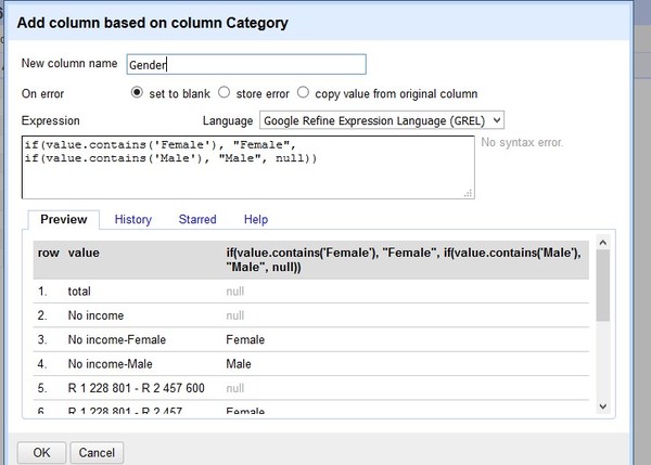
- Now in a new window you will have access to Google Refine Expression Language. This will give you multiple opportunities to analyse the data (You’ll find all you need to know here.)
- Similar to Excel, you will use the formula “if”. If the cell contains Female, output Female. If it contains Male, output Male. Otherwise, set the value as null. You will see the result in the right column.
- Now click OK and you will get:
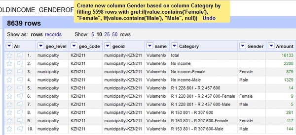
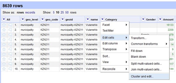
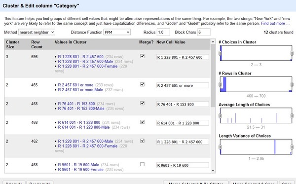
- You now have a column named “gender”. In order to analyse it, we no longer need the “total” since is just summarises both values. You can also cluster all the values and remove any “female” or “male”:
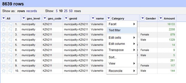
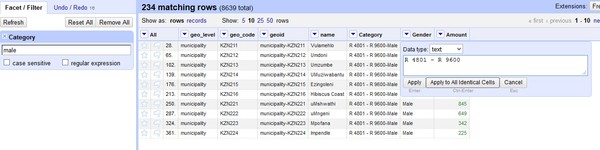
- If something “escapes” - is hidden or still not correct - filter it out and delete it:
- Hovering over the cell you will find an “edit” function:
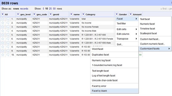
- Now we can use the “facet” function and try to find all the blank rows in the gender columns (remember that in this case blank rows means it is neither assigned to male nor female, but is a total)
- Now press the arrow again and choose “facet” and then choose the customised option “facet by blanks”.
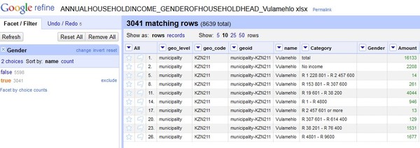
- You will see a new window in the left hand with all the cells that match the criteria of blank (true), and those that don’t (false). Select true to see them all.
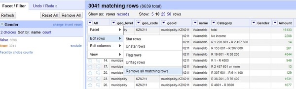
- For the final step, press the arrow sign in the column “All”, go to edit rows and remove all the rows that match your criteria:
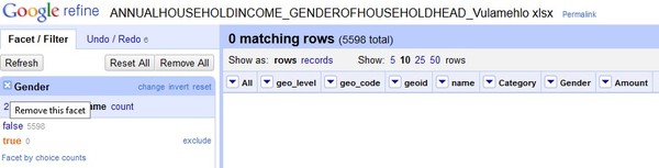
- Now close the “facet” and the cleaned up data will be ready to export and analyse:
- The final result ready to export to excel.
- If you read this and know of an even easier way to do this, we would love to hear from you.
- Happy OpenRefining! :)


