In early 2017 I presented a couple of workshops on the topic of CSS feature detection, titled CSS Feature Detection in 2017.
A friend of mine, Justin Slack from New Media Labs, recently sent me a link to the phenomenal Feature Query Manager (available for both Chrome and Firefox), by Nigerian developer Ire Aderinokun. This seemed to be a perfect addition to my workshop material on the subject.
However, upon returning to the material, I realised how much my work on the subject has aged in the last 18 months. The CSS landscape has undergone some tectonic shifts:
- The Atomic CSS approach, although widely hated at first has gained some traction through libraries like Tailwind, and perhaps influenced the addition of several new utility classes to Bootstrap 4.
- CSS-in-JS exploded in popularity, with Styled Components at the forefront of the movement.
- The CSS Grid Layout spec has been adopted by browser vendors with surprising speed, and was almost immediately sanctioned as production ready.
The above prompted me to not only revisit my existing material, but also ponder the state of CSS feature detection in the upcoming 18 months.
In short:
- ❓ Why do we need CSS feature detection at all?
- 🛠️ What are good (and not so good) ways to do feature detection?
- 🤖 What does the future hold for CSS feature detection?
Cross-browser compatible CSS
When working with CSS it seems that one of the top concerns always end up being inconsistent feature support among browsers. This means that CSS styling might look perfect on my browsers of choice, but might completely broken on another (perhaps an even more popular) browser.
Luckily, dealing with inconsistent browser support is trivial due to a key feature in the design of the CSS language itself. This behaviour, called fault tolerance, means that browsers ignore CSS code they don’t understand. This is in stark contrast to languages like JavaScript or PHP that stops all execution in order to throw an error.
The critical implication here is that if we layer our CSS accordingly, properties will only be applied if the browser understands what they mean. As an example, you can include the following CSS rule and the browser will just ignore it — overriding the initial yellow colour, but ignoring the third nonsensical value:
background-color: yellow;
background-color: blue;
background-color: aqy8godf857wqe6igrf7i6dsgkv;
To illustrate how this can be used in practice let me start with a contrived, but straight-forward situation:
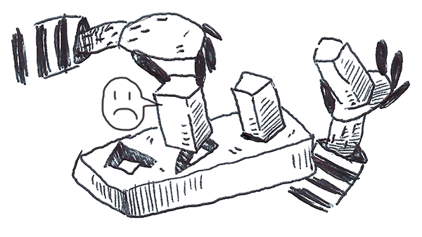
A client comes to you with a strong desire to include a call-to-action (in the form of a popup) on his homepage. With your amazing front-end skills, you are able to quickly produce the most obnoxious pop-up message known to man:
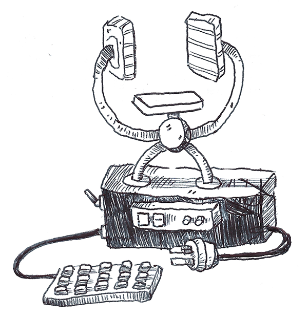
Unfortunately, it turns out that his wife has an old Windows XP machine running Internet Explorer 8. You’re shocked to learn that what she sees no longer resembles a popup in any shape or form.
Basic Popup Example on Internet Explorer 8
Luckily, we remember that by using the magic of CSS fault tolerance we can remedy the situation. We identify all the mission-critical parts of the styling (for example the shadow is a nice to have, but does not add anything useful usability wise) and buffer prepend all core styling with fallbacks.
This means that our CSS now looks something like the following (I’ve seperated the additions with a blank line for clarity):
.overlay {
background: grey;
border: 1px solid grey;
display: block;
height: 100%;
width: 100%;
background: rgba(0, 0, 0, 0.4);
display: flex;
justify-content: center;
align-items: center;
}
.popup {
width: 80%;
padding: 32px;
background: white;
margin: 40px auto;
border-radius: 8px;
border: 1px solid grey;
padding: 2rem;
background-color: rgba(255, 255, 255, 1);
min-width: 240px;
max-width: 80%;
box-shadow:
0 7px 8px -4px rgba(0,0, 0, 0.2),
0 13px 19px 2px rgba(0, 0, 0, 0.14),
0 5px 24px 4px rgba(0, 0, 0, 0.12);
}
button {
background-color: #e0e1e2;
color: #5c5c5c;
padding: 16px;
font-weight: bold;
margin-top: 16px;
margin-right: 12px;
font-weight: bold;
border-width: 0;
border-radius: 4px;
background-color: rgba(225, 225, 225, 1);
padding: 1rem;
color: rgba(95, 95, 95, 1);
box-shadow:
0 1px 3px 0 rgba(0,0,0,.2),
0 1px 1px 0 rgba(0,0,0,.14),
0 2px 1px -1px rgba(0,0,0,.12);
cursor: pointer;
font-weight: 700;
margin-top: 1rem;
margin-right: 0.75rem;
}
button:hover {
background-color: #c6c8c9;
background-color: rgb(198,200,201);
}
The above example generally falls under the broader approach of Progressive Enhancement. If you’re interested in learning more about Progressive Enhancement check out Aaron Gustafson’s second edition of his stellar book on the subject, titled Adaptive Web Design: Crafting Rich Experiences with Progressive Enhancement. (2016)

If you’re new to front-end development you might wonder how on earth does one know the support level of specific CSS properties. The short answer is that the more you work with CSS the more you will learn these by heart. However there are a couple of tools that are able to help us along the way:
- https://caniuse.com/ is a widely used directory that contains searchable, up to date support matrices for all CSS features.
- Stylelint has a phenomenal plugin-called called No Unsupported Browser Features that gives linting errors for unsupported CSS (defined via Browserslist) either in your editor itself or via a terminal command.
- There are several tools like BrowserStack or Cross Browser Testing that allow you to remotely test your website on different browser. Note that these are paid services, however BrowserStack has a free tier for open source projects.
However, even with all the above at our disposal learning CSS support by heart will help us plan our styling up front and increase our efficiency when writing CSS.
Limits of CSS Fault Tolerance
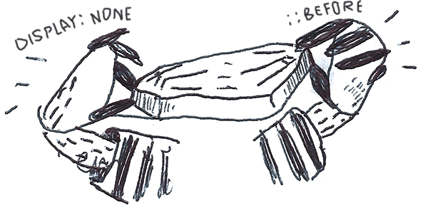
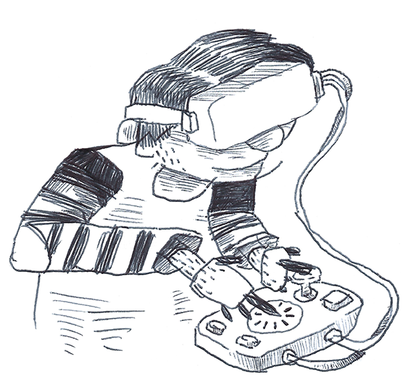
The next week the client returns with a new request. He wants to gather some feedback on from users on the earlier changes:
Popup with Radio Buttons Example
Being more proactive this time you use the technique illustrated above to establish a base level of styling that works on Internet Explorer 8. Unfortunately we run into a problem:
In order to replace the default radio buttons with ASCII hearts we use the ::before pseudo-element. However this pseudo-element is not supported in Internet Explorer 8. This means that the heart icon does not render, however the display: none on the <input type="radio"> HTML tag still triggers on Internet Explorer 8. The implication being that neither the replacement behaviour nor the default behaviour is shown.
In short we have a rule (display: none) whose execution should not be bound to its own support (and thus it’s own fallback structure), but to the support level of a completely separate CSS feature (::before).
For all intents and purposes, the common approach is to explore whether there are more straightforward solutions that do not rely on ::before. However for the sake of this example let say that the above solution is non-negotiable (and sometimes they are).
Enter User Agent Detection
A solution might be to see if there is a way to determine what browser the user is using, and then only apply display: none if their browser support the ::before pseudo-element.
In fact this approach is almost as old as the web itself. It is known as User Agent Detection or more colloquially Browser Sniffing.
It is usually done as follows:
- All browsers add a JavaScript property on the global window object called navigator, this object contains a userAgent string property.
- In my case the userAgent string is: Mozilla/5.0 (Windows NT10.0;Win64;x64) AppleWebKit/537.36 (KHTML, like Gecko) Chrome/67.0.3396.9 Safari/537.36.
- Mozilla Developer Network has a comprehensive list of how the above can be used to determine the browser.
- If we are using Chrome the following should return true: (navigator.userAgent.indexOff(’chrome) !== -1).
- However under the Internet Explorer section on MDN we just have Internet Explorer doesn’t put its name in the BrowserName/VersionNumber format.
- Luckily Internet Explorer provides its own native detection in the form of Conditional Comments.
This means that adding the following in our HTML should suffice:
<!--[if lt IE 9]>
<style>
input {
display: block;
}
</style>
<![endif]-->
This means that should the browser be a version of Internet Explorer lower than version 9 (IE 9 supports ::before), the above will be applied — effectively overriding the display: none property.
Seems straightforward enough?
Unfortunately over time some critical flaws emerged in User Agent Detection, so much that Internet Explorer stopped supporting Conditional Comment from Internet Explorer 10 onward. You will also notice that in the Mozilla Developer Network link itself the following is presented in an orange alert:
It’s worth re-iterating: it’s very rarely a good idea to use user agent sniffing. You can almost always find a better, more broadly compatible way to solve your problem!
The biggest drawback of User Agent Detection is that over time browser vendors started spoofing their user agent strings due to the following:
- Developer adds CSS feature that is not supported in browser.
- Developer adds User Agent Detection to code to serve fallbacks on browser.
- Browser eventually adds support for that specific CSS feature.
- Original Agent Detection code is not updated to take this into consideration.
- Code always display fallback, even if browser now supports feature.
- Browser uses fake user agent string to give users best experience on web.
Furthermore, even if we were able to infallibly determine every type browser and version, we would have to actively maintain and update our User Agent Detection to reflect the feature support state of those browsers (notwithstanding browsers that have not even been developed yet).
It is important to note that although there are superficial similarities between feature detection and User Agent Detection. Feature detection takes a radically different approach than User Agent Detection. According to the Mozilla Developer Network, when we do feature detection we are essentially doing the following:
- Testing whether a browser is actually able to run a specific line (or lines) of HTML, CSS or JavaScript code. 🔎
- Then taking a specific action based on the outcome of this test. 💪
We can also look to Wikipedia for a more formal definition:
Feature detection (also feature testing) is a technique used in web development for handling differences between runtime environments (typically web browsers or user agents), by programmatically testing for clues that the environment may or may not offer certain functionality. This information is then used to make the application adapt in some way to suit the environment: to make use of certain APIs, or tailor for a better user experience.
While a bit esoteric, this definition does highlight two important aspects of feature detection:
- Feature detection is a technique, as opposed to a specific tool or technology. This means that there are various (equally valid) ways to accomplish feature detection.
- Feature detection programmatically tests code. This means that browsers actually run a piece of code to see what happens, as opposed to merely using inference or comparing it against a theoretical reference/list as done with User Agent Detection.
The core concept is not to ask “What browser is this?” It’s to ask “Does your browser support the feature I want to use?”. - Rob Larson, The Uncertain Web: Web Development in a Changing Landscape (2014)
CSS feature detection with @supports
Most modern browsers support a set of native CSS rules called CSS conditional rules. These allow us to test for certain conditions within the stylesheet itself. The latest iteration (known as module level 3) is described by the Cascading Style Sheets Working Group as follows:
This module contains the features of CSS for conditional processing of parts of style sheets, conditioned on capabilities of the processor or the document the style sheet is being applied to. It includes and extends the functionality of CSS level 2 [CSS21], which builds on CSS level 1 [CSS1]. The main extensions compared to level 2 are allowing nesting of certain at-rules inside ‘@media’, and the addition of the ‘@supports’ rule for conditional processing.
If you’ve used @media, @document or @import before you already have experience working with CSS conditional rules. For example when using CSS media queries we do the following:
- Wrap a single or multiple CSS declarations in a code block with curly brackets, { }.
- Prepend the code block with a @media query with additional information.
- An optional media type. This can either be all, print, speech or the commonly used screen type.
- And/or an expression determining the scope. For example if we use (min-width: 300px) and (max-width: 800px) it will trigger the query if the screen size is wider than 300 pixels and smaller than 800 pixels.
The feature queries spec prescribes behaviour that is conveniently similar to the above example. Instead of using a query expression to set a condition based on the screen size, we write an expression to scope our code block according to a browser’s CSS support:
The ‘@supports rule allows CSS to be conditioned on implementation support for CSS properties and values. This rule makes it much easier for authors to use new CSS features and provide good fallback for implementations that do not support those features. This is particularly important for CSS features that provide new layout mechanisms, and for other cases where a set of related styles needs to be conditioned on property support.
In short feature queries are a small built-in CSS tool that allow us to only execute code (like the display: none example above) when a browser supports a separate CSS feature, and much like media queries we are able to chain expressions as follows: @supports (display: grid) and ((animation-name: spin) or (transition: transform(rotate(360deg)).
So theoretically we should be able to do the following:
@supports (::before) {
input {
display: none;
}
}
Unfortunately it seems that the display: none property did not trigger, in-spite of the fact that your browser probably supports ::before.
However there are some caveats to using @supports.
- First and foremost, CSS feature queries only support CSS properties and not CSS pseudo-element, like ::before.
- Secondly, if we tested the above with another feature in our code not supported in Internet Explorer 8, for example the transform property, we will get the correct behaviour on Internet Explorer 8. However, on Internet Explorer 9 the code will not execute even though transform is supported in IE 9. Furthermore, the code works on the latest Chrome. What gives? In short, @supports is a CSS feature, with a support matrix of its own.
CSS feature detection with Modernizr
Luckily, the fix is fairly easy! It comes in the form of an open-source JavaScript library, named Modernizr, initially developed by Faruk Ateş (However it now has some pretty big names behind it like Paul Irish from Chrome and Alex Sexton from Stripe).
Before we dig into Modernizr, let’s address a subject of great confusion for many developers (partly due to the name ‘Modernizr’ itself). Modernizr does not transform your code or magically enable unsupported features. In fact the only change Modernzr makes to your code is appending specific CSS classes to your <html> tag.
This means that you might end up with something like the following:
<html class="js flexbox flexboxlegacy canvas canvastext webgl no-touch geolocation postmessage websqldatabase indexeddb hashchange history draganddrop websockets rgba hsla multiplebgs backgroundsize borderimage borderradius boxshadow textshadow opacity cssanimations csscolumns cssgradients cssreflections csstransforms csstransforms3d csstransitions fontface generatedcontent video audio localstorage sessionstorage webworkers applicationcache svg inlinesvg smil svgclippaths">
That is one big HTML tag! However, it allows us do something super powerful: Use the CSS descendant selector, to conditionally apply CSS rules.
When Modernizr runs it uses JavaScript to detect what the user’s browser supports, and if it does it adds the name of the feature as a class to the <html> . Alternatively, if the browser does not support the feature it prefixes the class with no- (for example no-generatedcontent in our ::before example). This means that we can write our conditional rule as follows:
.generatedcontent input {
display: none
}
In addition, we are able to replicate the chaining of @supports expressions in Modernizr as follows:
/* default */
.generatedcontent input { }
/* 'or' operator */
.generatedcontent input, .csstransforms input { }
/* 'and' operator */
.generatedcontent.csstransformsinput { }
/* 'not' operator */
.no-generatedcontent input { }
Since Modernizr runs in JavaScript (and does not use any native browser API’s it’s effectively supported on almost all browsers). This means by leveraging generatedcontent and csstransforms we are able to cover all our bases for Internet Explorer 8, while still serving bleeding-edge CSS to the latest browsers.
It is important to note that since the release of Modernizr 3.0, you are no longer able to download a stock-standard modernizr.js file with everything except the kitchen sink. As of version 3.0 you have to explicitly generate your own custom Modernizr code via their wizard (to copy or download). This is most likely in response to the increasing global focus on web performance over the last couple of years.
So I should always use Modernizr?
Given that Modernizr is effectively supported across all browsers, is there any point in even using CSS feature queries? Ironically, I would not only say that we should — but that feature queries should still be our first port of call.
First and foremost, the fact that Modernizr does not plug directly into the browser API is it’s greatest strength - since it does not rely on the availability of a specific browser API. However, this benefit comes a cost, and that cost is additional overhead to something most browsers support out of the box through @supports — especially when you’re delivering this additional overhead to all users indiscriminately in order to a small amount of edge users. It is important to note that in our example above, that Internet Explorer 8 currently only stands at 0.18% global usage).
Compared to the light touch of @supports, Modernizr has the following drawbacks:
- The approach underpinning development of Modernizr is driven by the assumption that Modernizr was ‘meant from day one to eventually become unnecessary’.
- In the majority of cases Modernizr needs to be render blocking, this means that Modernizr needs to be downloaded and executed in JavaScript before a web page can even be shown content on the screen — dramatically decreasing our page load time (especially on mobile devices!).
- In order to run tests, often times Modernizr has to actually build hidden HTML nodes and test whether it works. For example in order to test for canvas support Modernizr executes the follow JavaScript code: return !!(document.createElement('canvas').getContext && document.createElement('canvas').getContext('2d'));. This consumes CPU processing power that could be used elsewhere.
- The CSS descendant selector pattern used by Modernizr increases CSS specificity (see Harry Roberts’ excellent article on why ‘specificity is a trait best avoided’).
- Although Modernizr covers a lot of tests (150+), it still does not cover the entire spectrum of CSS properties like @support does. The Modernizr team actively maintains a list of these undetectables.
Given that that feature queries has already been widely implemented across the browser landscape (covering about 93.42% of global browser at the time of writing) It’s been a good while since I’ve used Modernizr. However it is good to know that it exists as an option should we run into the limitations of @supports or if we need to support users still locked into older browsers/devices (for example: employees of large corporations/state departments or lower range smartphones).
Furthermore when using Modernizr it is usually in conjunction with @supports as follows:
.generatedcontent input {
display: none;
input:checked + label::before {
font-size: 40px;
}
@supports (transform: scale(2)) {
input:checked + label::before {
font-size: 20px;
transform: scale(2);
}
}
}
In the above example the following will happen:
- If ::before is not supported our CSS will fallback to the default HTML radio select.
- If transform(scale(2)) is not supported, but ::before is supported the heart icon will scale by means of an increase in font-size (however this will reflow the DOM)
- If transform(scale(2) and ::before is supported the heart icon will scale via the transform property, which will not cause the DOM to reflow.
The future of CSS feature detection
Up until this point I’ve shied away from talking about feature detection in a world being eaten by JavaScript, or possibly even a post-JavaScript world. Perhaps intentionally so, since current iterations at the intersection between CSS and JS are extremely contentious and divisive.
From that moment on, the web community was split in two by an intense debate between those who see CSS as an untouchable layer in the “separation of concerns” paradigm (content + presentation + behaviour, HTML + CSS + JS) and those who have simply ignored this golden rule and found different ways to style the UI, typically applying CSS styles via JavaScript. This debate has become more and more intense every day, bringing division in a community that used to be immune to this kind of “religion wars”.
- Cristiano Rastelli, Let there be peace on CSS (2017)
However, I think exploring how to apply feature detection in the modern CSS-in-JS toolchain might be of value as follows:
- An opportunity to explore how CSS feature detection would work in a radically different environment.
- Showcasing feature detection as a technique, as opposed to a specific technology or tool.
With this in mind, let us start by examining an implementation of our popup by means of the (at the time of writing) most widely-used CSS-in-JS library, Styled Components:
Popup with React and Styled Components Example
In our previous examples we’ve been able to conditionally execute CSS rules based on the browser support of ::before (via Modernizr) and transform (via @supports ). However, by leveraging JavaScript we are able to take this even further. Since both @supports and Modernizr expose their API’s via JavaScript we are able to conditionally load entire parts of our popup based solely on browser support.
Keep in mind that you will probably need to do a lot of heavy lifting to get React and Styled Components working in a browser that does not even support ::before ( checking for display: grid might make more sense in this context), however for the sake of keeping with the above examples let us assume that we have React and Style Components running in Internet Explorer 8 or lower.
In the example above you will notice that we’ve created a component, called ValueSelection. This component returns a clickable button that increments the amount of likes. If you are viewing the example on a slightly older browser you might notice that instead of the button you will see a dropdown with values from 0 to 9
In order to achieve this we’re conditionally returning an enhanced version of the component only if the following conditions are met:
if (
CSS.supports('transform: scale(2)') &&
Modernizr.generatedcontent
) {
return (
<React.Fragment>
<Modern type="button" onClick={add}>{string}</Modern>
<input type="hidden" name="liked" value={value} />
</React.Fragment>
)
}
return (
<Base value={value} onChange={select}>
{
[1,2,3,4,5,6,7,8,9].map(val => (
<option value={val} key={val}>{val}</option>
))
}
</Base>
);
What is intriguing about this approach is that the ValueSelection only exposes two parameters:
- The current amount of likes
- The function to run when the amount of likes are updated.
<Overlay>
<Popup>
<Title>How much do you like popups?</Title>
<form>
<ValueSelection value={liked} change={changeLike} />
<Button type="submit">Submit</Button>
</form>
</Popup>
</Overlay>
In other words, the component’s logic is completely separate from its presentation. The component itself will internally decide what presentation works best given a browser’s support matrix. Having the conditional presentation abstracted away inside the component itself opens the door to exciting new ways of building cross-browser compatible interfaces when working in a front-end and/or design team.
Additional Resources
The above is an extension of a series of developer/designer workshops I’ve presented the past couple of years. The slides for the workshop are available for free at https://slides.com/schalkventer/css-feature-detection.
Both the above article and the slides are licensed under Creative Commons Attribution-ShareAlike 4.0. This means that you are allowed to use it in your own work (even for profit), as long as you credit this article and allow others to share your work in the same capacity.
If you are interested in diving deeper into the above you can visit the following resources:


